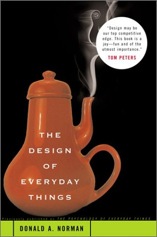
The Design of Everyday Things by Don Norman

Do you struggle when trying to use a new gadget?
Is it easy to use your mobile phone?
Do you use all the functions in your software applications?
Do you find that when opening some doors you have to hesitate to decide if you need to push, pull or slide?
Don’t blame yourself – it is the result of poor design.
Good design not only makes things easier to use but reduces errors.
Valtrex buy online purchase Indocin online order Cytotec online
“If an error is possible, someone will make it. The designer must assume that all possible errors will occur and design so as to minimise the chance of the error in the first place, or its effects once it gets made. Errors should be easy to detect, they should have minimal consequences, and if possible, their effects should be reversible.”
This 1988 work by Don Norman is the classic text on useability.
Recently, I waited for some time in line at a coffee shop. When I got to the front, they were surprised that I wanted to order a coffee.
“This is where you pay”, they said. “You order over at that line”.
There was not one sign, subtle or otherwise, that I could find that would give a new customer a clue that this was the system in this cafe.
How well designed are our surgeries?
Is it clear to new patients what they are meant to do when they arrive?
How about when they are leaving?
Are the clinical instructions we give to patients easy to follow? What will they remember?
Do we design our consultations to reduce errors?
Have a look at your surgery through the eyes of a new patient.

